Setbacks and Data-driven Video
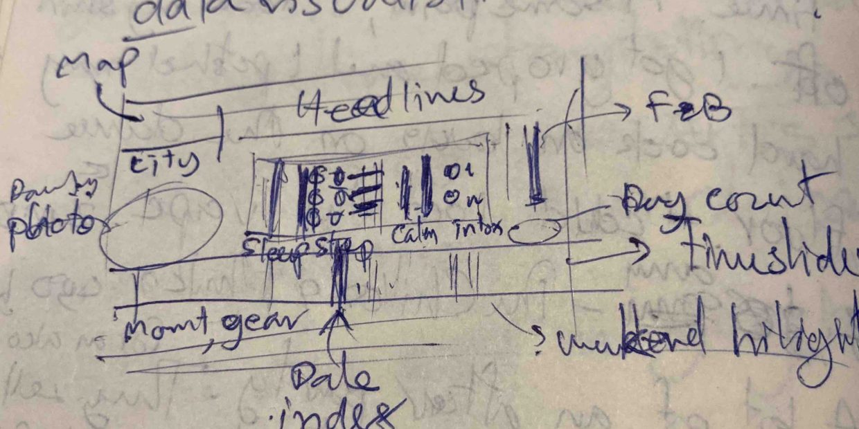
Once the static timeline was done, the video was started. While drafting the layout, various components were identified. I went through the data again but this time also the photos, picked one for each day, and arranged them chronologically for 1 second each in Premier Pro. Then, I created animated travelling paths on a map in After Effects, using keyframes. Those two components were straightforward for me.
The next level was data-driven text: dates, locations, seasons, subheadings, and photo captions. I found this tutorial to be the simplest to implement. It was optimised for boolean variables: exercise activities and intoxicants. I also use it for placeholders for the hardest elements—data-driven animations: steps, calorie in-out, sleep, productive hours, and expense.
The first few versions were to adjust the layout and check the synchronisation of all the elements: photos, animated map, and data-driven text. The background colours responding to seasons were also keyframe animated. In this process, one advantage of a data-driven video stood out—editability. The text was amended in the database, not in the program. This would be painstaking with a keyframe animation.
Unfortunately, After Effects crashed twice while I was playing with animation codes. Both times corrupted the working files. I had to start over twice including the animated map since they were in the same files. The final hurdle was the login issue with Adobe CC. I had to move the working files to another laptop. At that point, I needed to pause the animation effort to finish the video within the internal deadline. Hence, it wouldn’t be any animated bar graphs as it was envisioned, for now.
After the technical troubleshooting, the design compromise, and the updated hardware setup, the video was almost complete but it missed something for the flow—audio. Again, I went through the media library for mobile videos to extract some ambient sound responding to the locations. But it made better sense to include the videos as the visual references. A new element was edited in Premiere Pro and added to the video as background ambience.
There you go, the making of data visualisations to wrap up 400 days of being a digital nomad!
Wrapping up the Journey
While looking through the materials: logs, journals, photos, and videos; I relived those moments and pondered. The world has been fluctuating for years but we also have come so far. Personal stories of people I encountered were touching. For myself, the lessons were immense. My perspective wasn’t just widened but my inner self was also strengthened.
One notable synchronicity. The current notebook I started in December 2021 triggered the idea of this journey. It was the solar eclipse, to be exact. The Sun and the Moon met my natal triple conjunction: Jupiter, Mercury, and Venus. (I didn’t realise that pivotal transit at the time.) And it was alongside me for the entire adventure. Now, while I’m wrapping up the project, there aren’t many pages left. Another solar eclipse also occurred last weekend. The Sun and the Moon hovered over my natal Moon. It’s a nice round finish, I find.
So, this marked the conclusion of my digital nomad journey from the embarkment to the final video project about it. I used all of my media production skills in this wrapping-up project and learned a new one—data-driven video. Even though bar graph animations weren’t realised, they will be created at some point.
I can see the future of this format and would like to develop it further. Daily data logging can be streamlined. Data visualisation workflow can be optimised. But for now, priorities are data reconstruction, apartment renovation to put it on the market, and strategies for the next chapter including travelling.
1 Pingback