The production of my digital nomad data visualisations became a gigantic sea monster. Although it was ambitious, the static infographics and the data-driven video were achieved. Setbacks were frustrating but inevitable. Before this ordeal fades from my memory, let me share how I went through this learning curve. This wrapping-up project is a journey in itself.
Logging Habit
For my sins, logging personal data is my habit. It helps me monitor and make decisions in life: calorie intake, exercise, expense, and so on. These are the tools for my everyday logs.
- Fitbit for steps, sleep, and energy burned (calories out)
- MyFitnessPal for diet diary
- Wallet by BuggetBakers for personal finance
- iPhone SE 2020 for photos and videos
- Default Mac iCloud apps: Calendar, Numbers, and Pages for general logging, journaling, and referencing
Logging is my daily practice except for journaling. I used to jot down the travelling in a physical notebook but switched to the cloud to save pages. It worked better with mobility, editability, and searchability. I always set a time for journalling every week and started a new heading when changing cities. It became a good reference when I needed to look back.
However, I didn’t think I’d do anything with the collected data until late April (therefore, some logs were missing.) From then, the idea of data visualisation was crystalised. The beast was targeted.
Prepping Data and Static Timelines
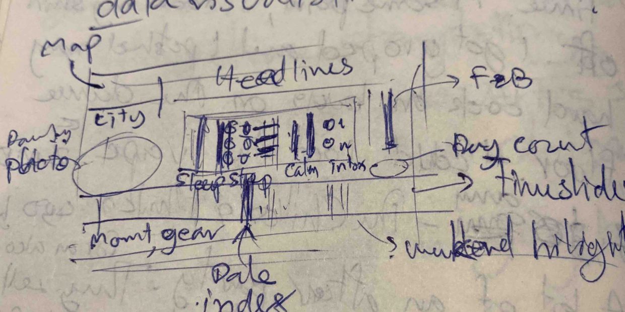
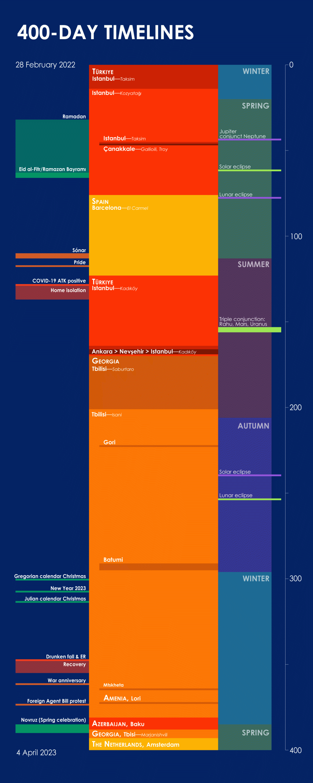
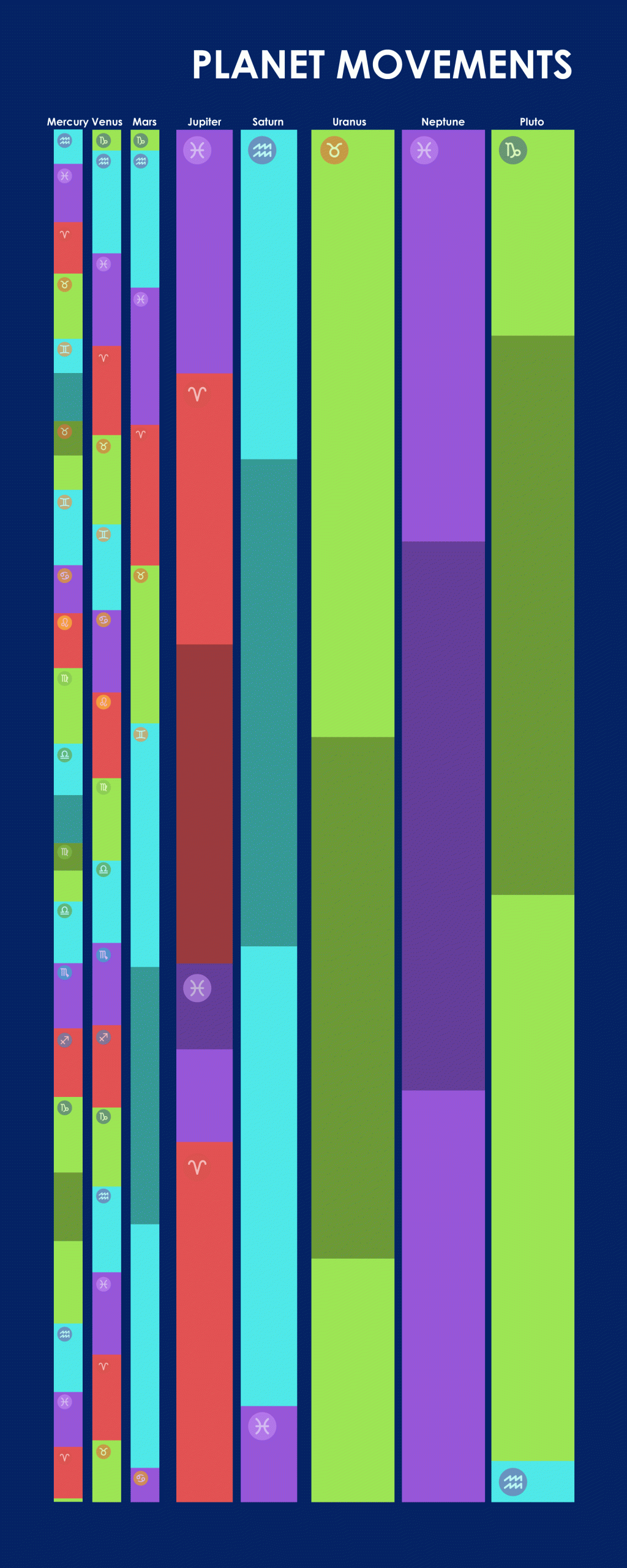
For the start, I went through all the logs on the spreadsheet, downloaded the datasets from Fitbit and Wallet, aligned them with the dates and locations, and cleaned the data. The fact that the trip was exactly 400 days made this project intriguing. Some circumstances could give a round number to play with.
The biggest challenge in my vision was data-driven bar graph animations. If the production was approached with the traditional method—keyframe animation, that would be 400 keyframes for each dataset. I’ve animated several data visualisations before but with keyframes. And those were not this scale. Besides, I was eager to learn new skills. So, the strategy was to take time to study it with online tutorials.
Meanwhile, the other part of my brain was on the design—my comfort zone. Hence, I worked on the static timelines first to get a sense of the overall scheme. Moreover, I could test the workflow from data collecting to data visualisation. Basically, each dataset, from day 0 to 400, was scaled to the same height so that all the events and durations were aligned.
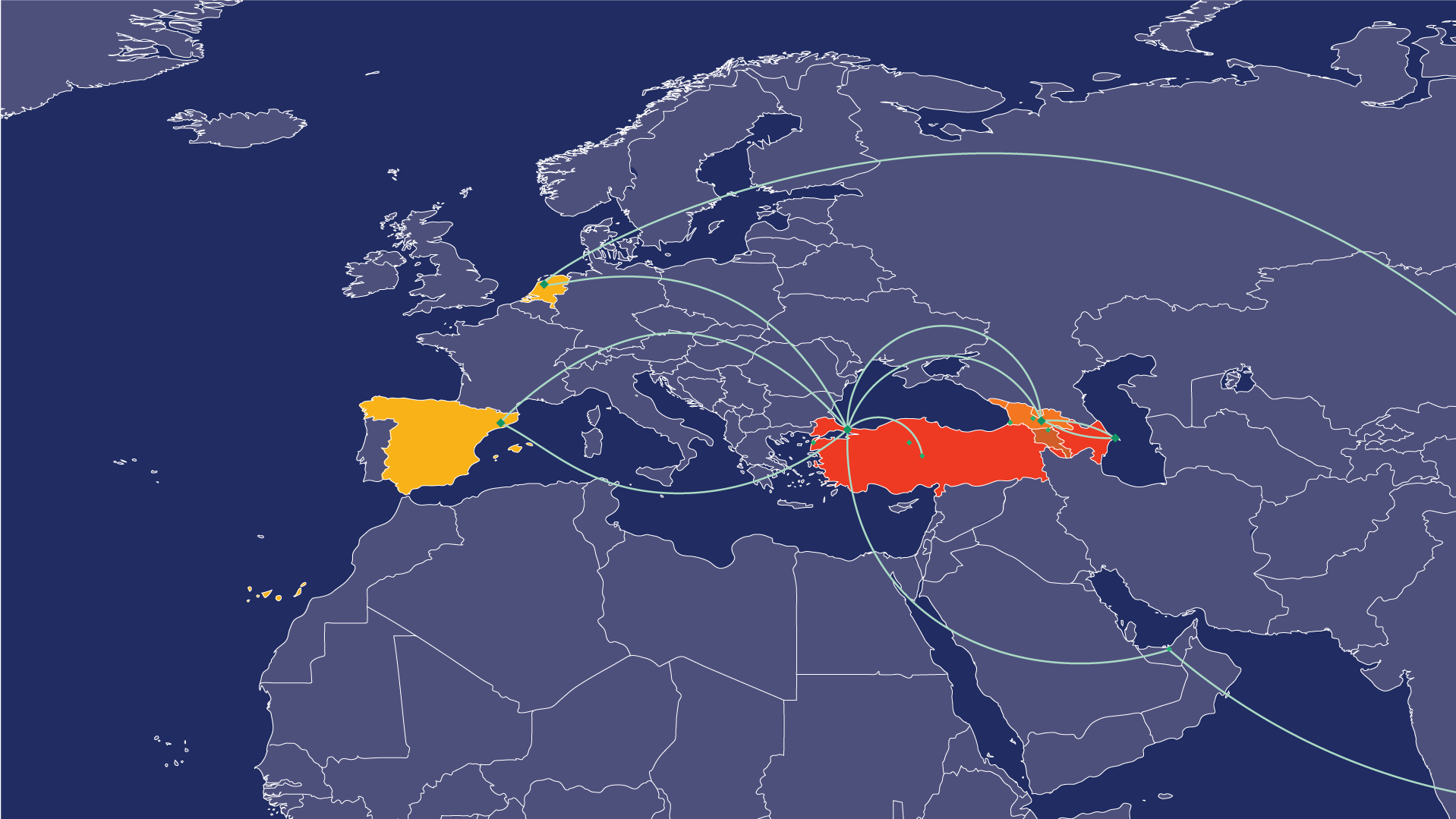
The production platform was Adobe CC Suite on MacBook Pro,13-inch, 2017. It was efficient enough for the static timelines and the map on Illustrator. However, like me, this laptop’s capacity wasn’t up for an ambitious data-driven animation. I don’t know if a 50-year-old brain of mine or an old laptop contributed more to the setbacks later on.
The real beast awaited.
1 Pingback